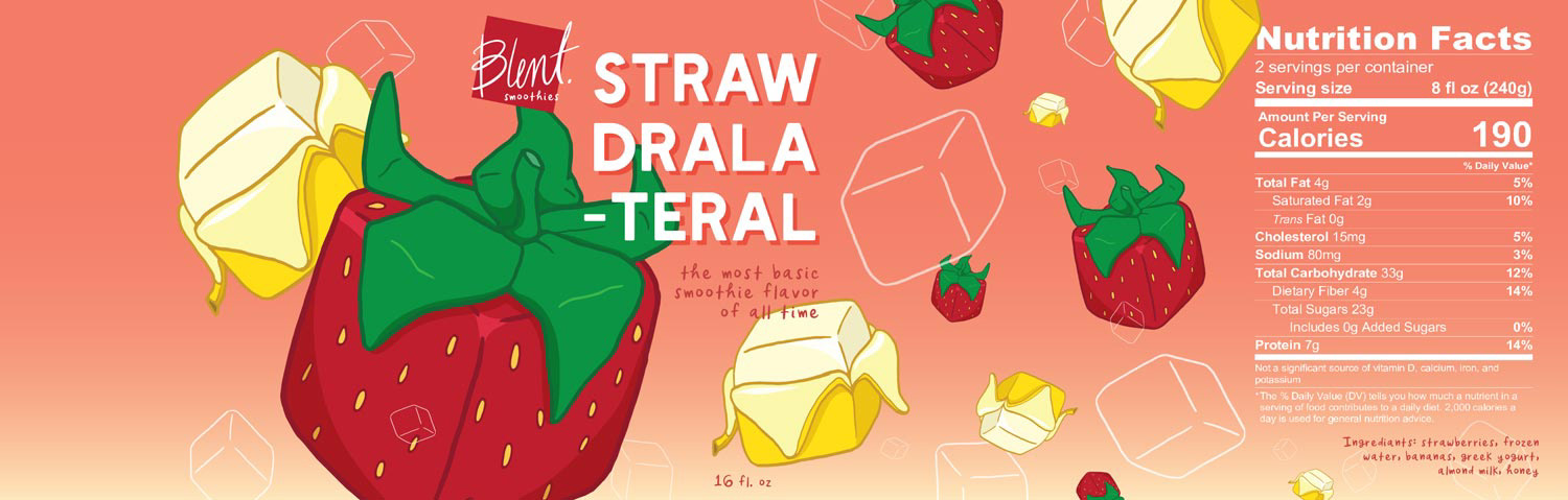
Packaging design for a kooky & colorful smoothie company.

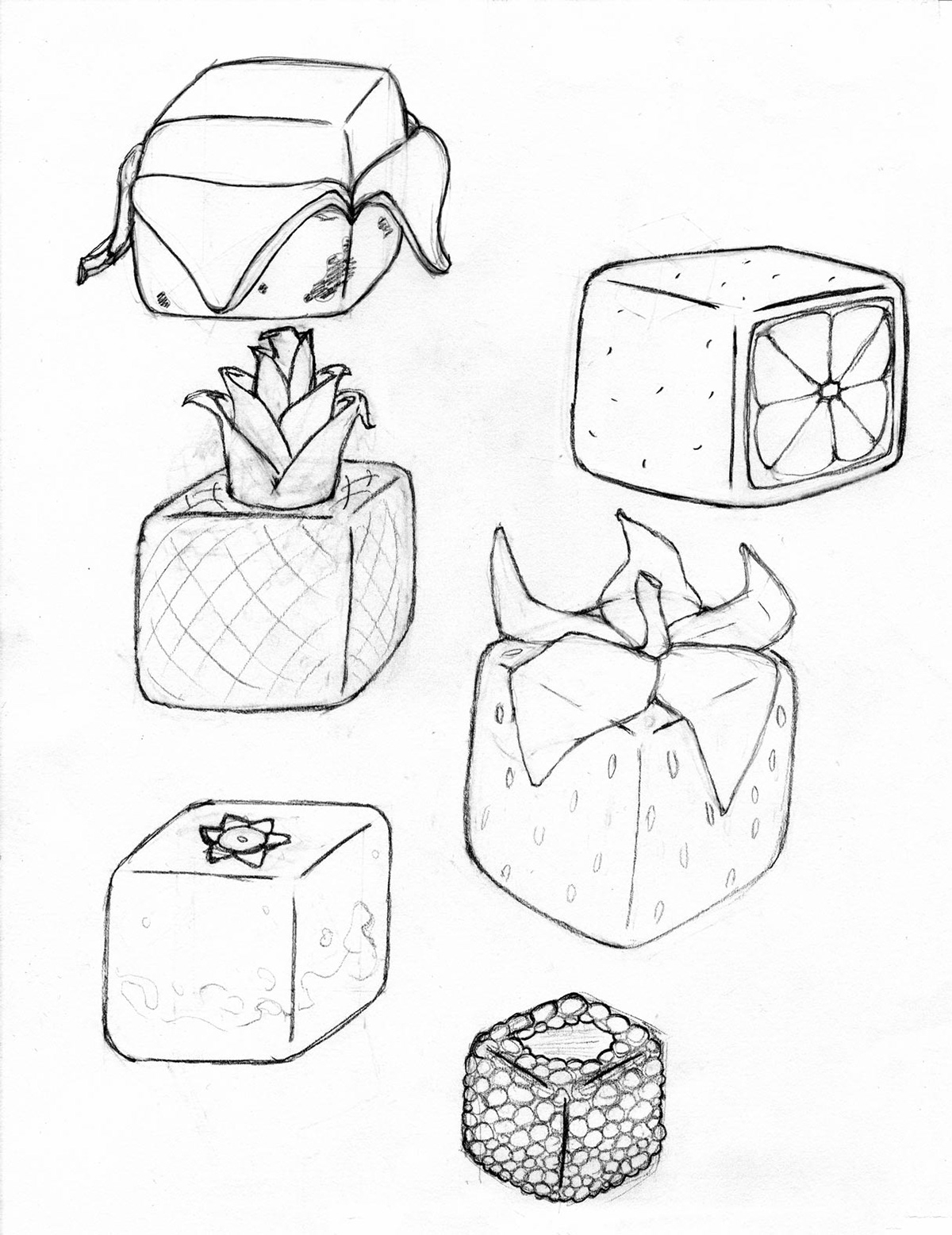
Blent smoothies are an imagined product for all the squares out there. It all started as a desire to draw some delicious fruit, but traditional fruit illustrations were boring. Then I thought, what would it look like if bananas were square? And thus, cube fruit was born. The idea was bright and interesting, but also silly, so I kept with that theme through the process of creating the brand. Blent, a play on the word “blended”, was the name I settled on because it defined the product while still being interesting, but also a little silly. I wanted the packaging to have an atmospheric quality, as if the label were a panoramic shot of a space blender with fruit and ice cubes floating and flying around at low gravity.
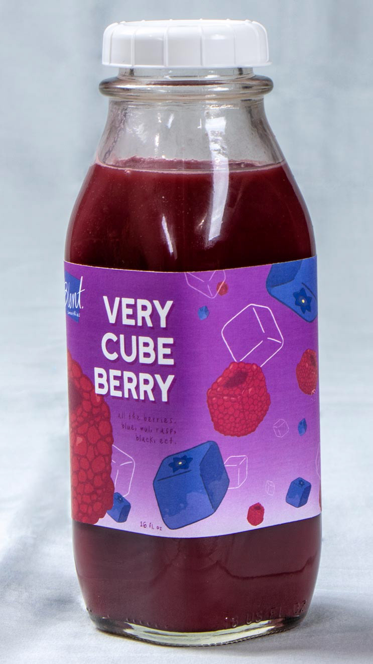
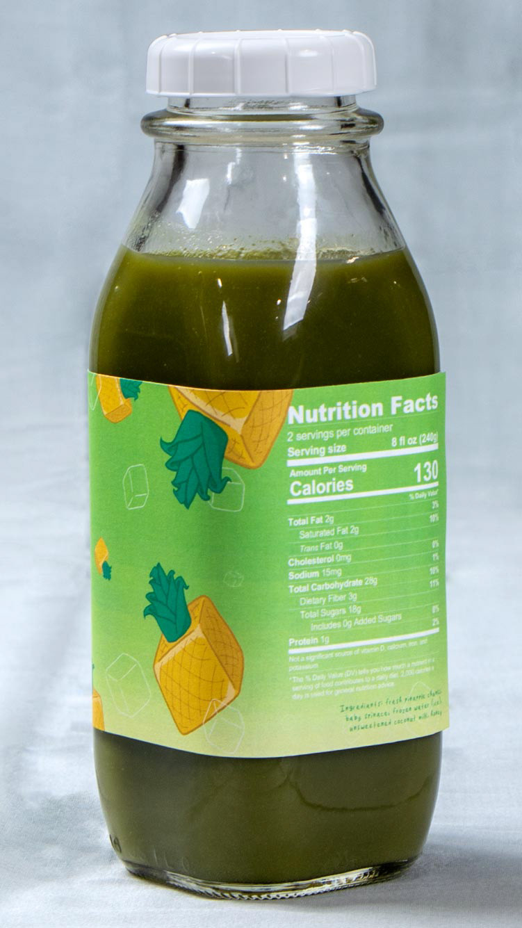

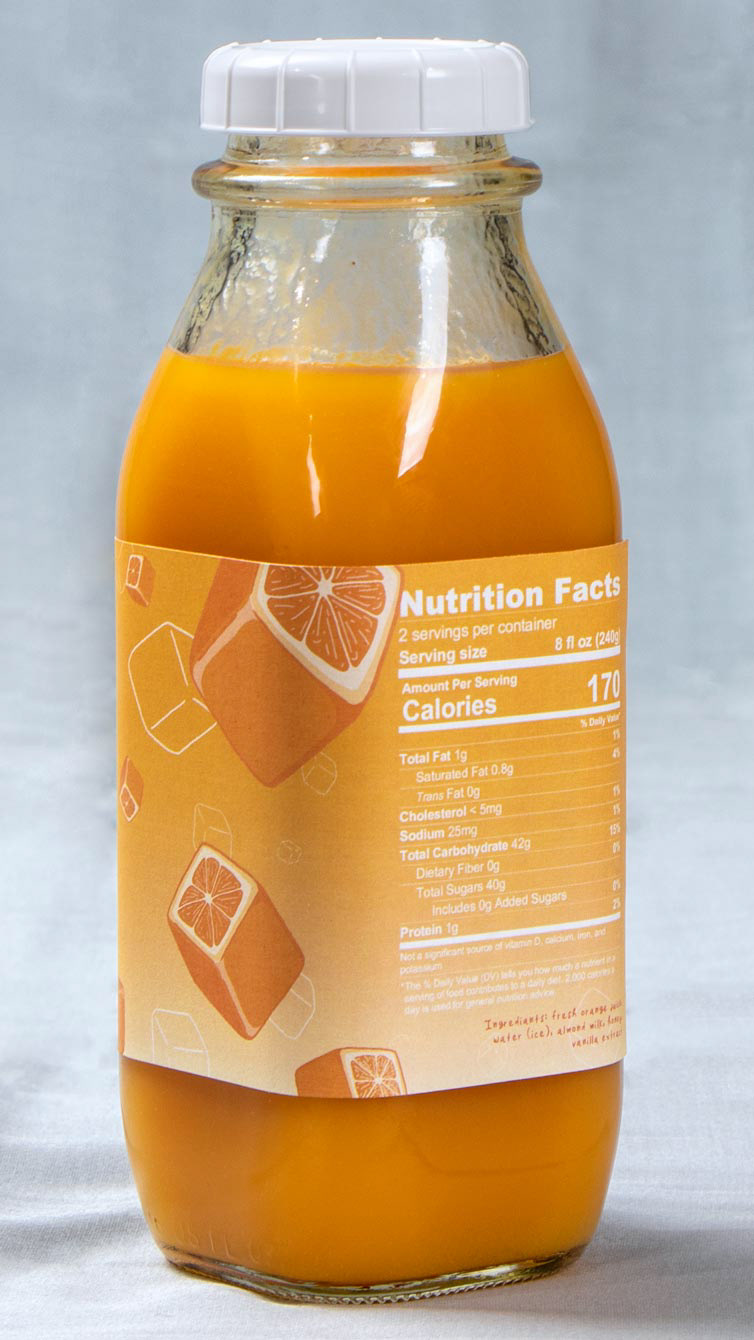
Label Designs


Logo Design

Illustrations