The branding campaign for an imagined Alterations company with an approachable and friendly identity.
Featuring both print & digital collateral, including a scheduling & invoicing app.
Featuring both print & digital collateral, including a scheduling & invoicing app.
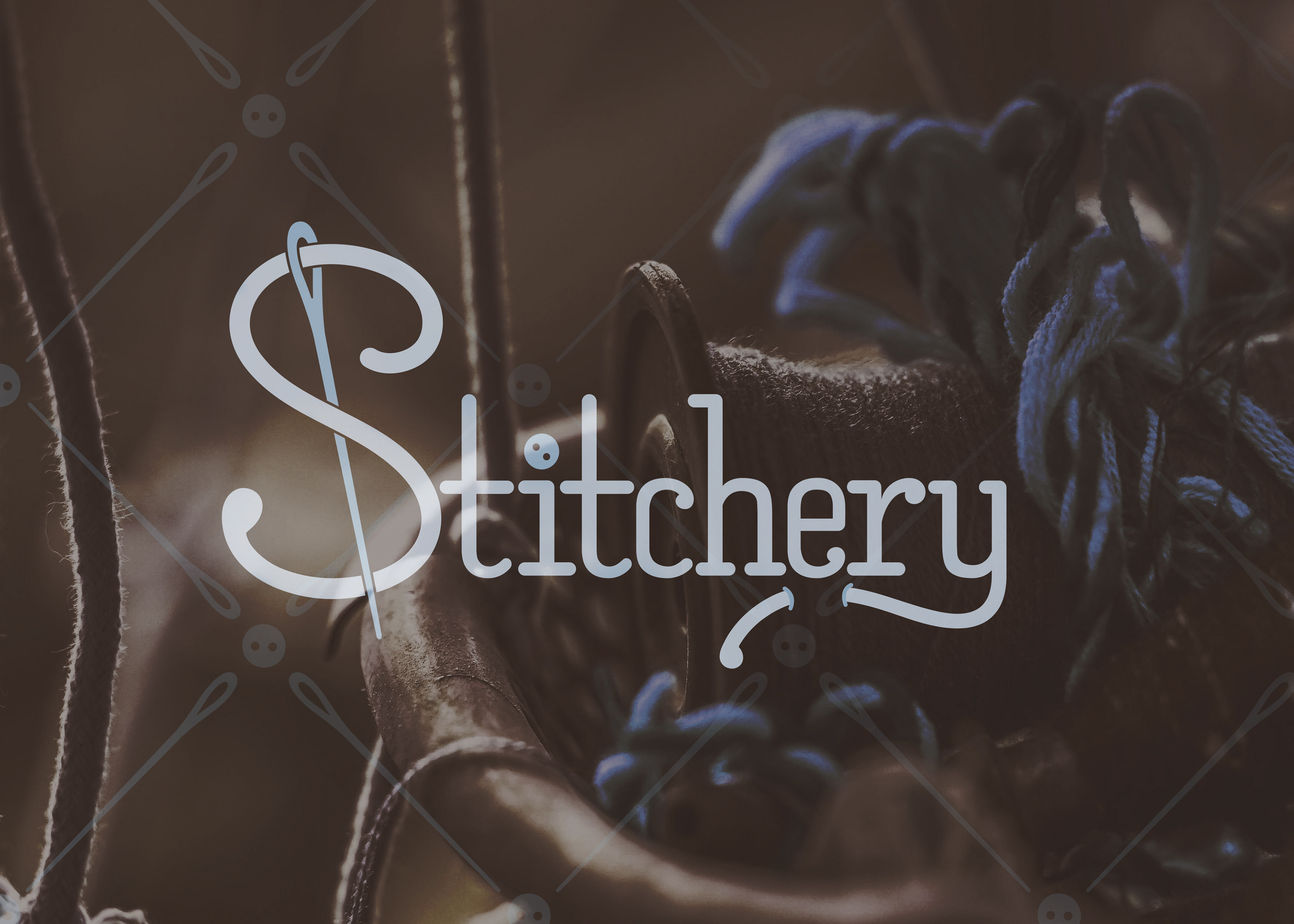
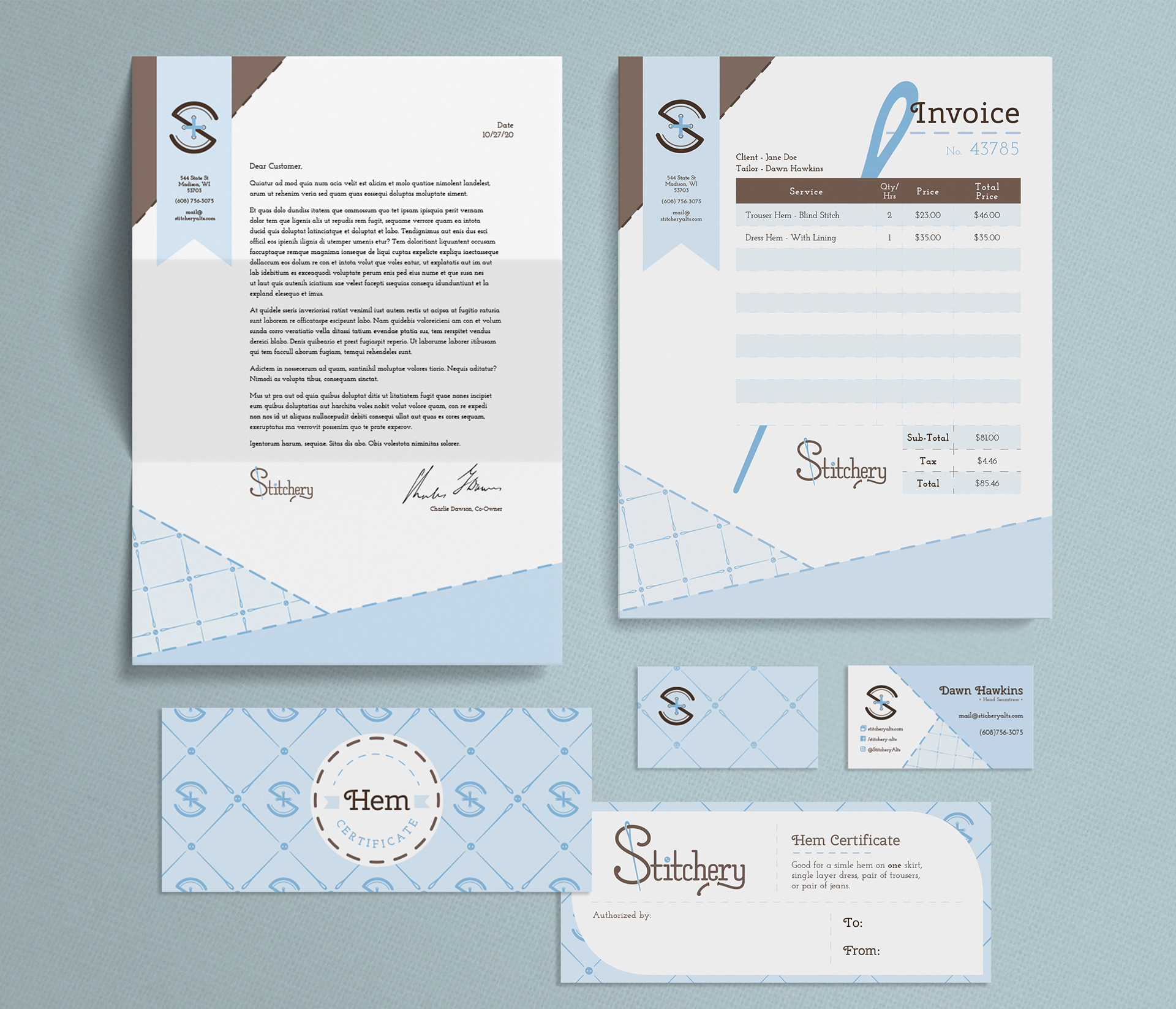
The Stitchery’s mission is to provide a variety of tailoring and mending services in a warm and inviting atmosphere. I wanted to evoke feelings of Grandma’s sewing room with warm & trustworthy browns paired with a soft & feminine robin’s egg blue accent for a little bit of life. Sewing imagery is incorporated through stitching-like dashed lines, sewing needles, buttons, ribbon-ends, and a quilt-like surface pattern design. In companion to a clear and easy to use website, something a lot of similar companies are lacking, I also designed an app for scheduling appointments, invoicing clients, and pick-up notification to bring the alterations industry into the 21st century.

Wordmark design

Alternate Icon
The slab-serif typeface used to create the wordmark logo was created by hand. Letterforms were loosely based on the font Archer, but were heavily modified to match the more condensed quality of my original sketch. I would love to expand it onto a full font.
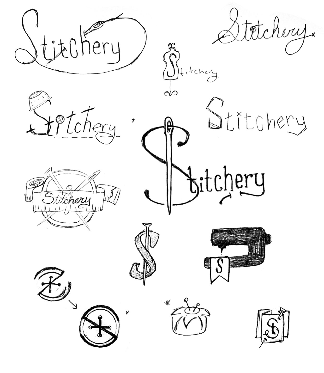
Sketches

Previous Interations
Print Collateral and Swag
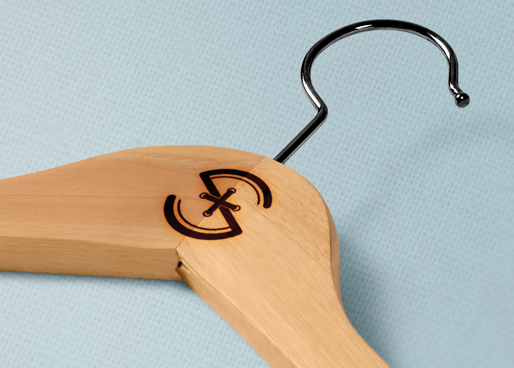
Custom Hanger

"Uniform"
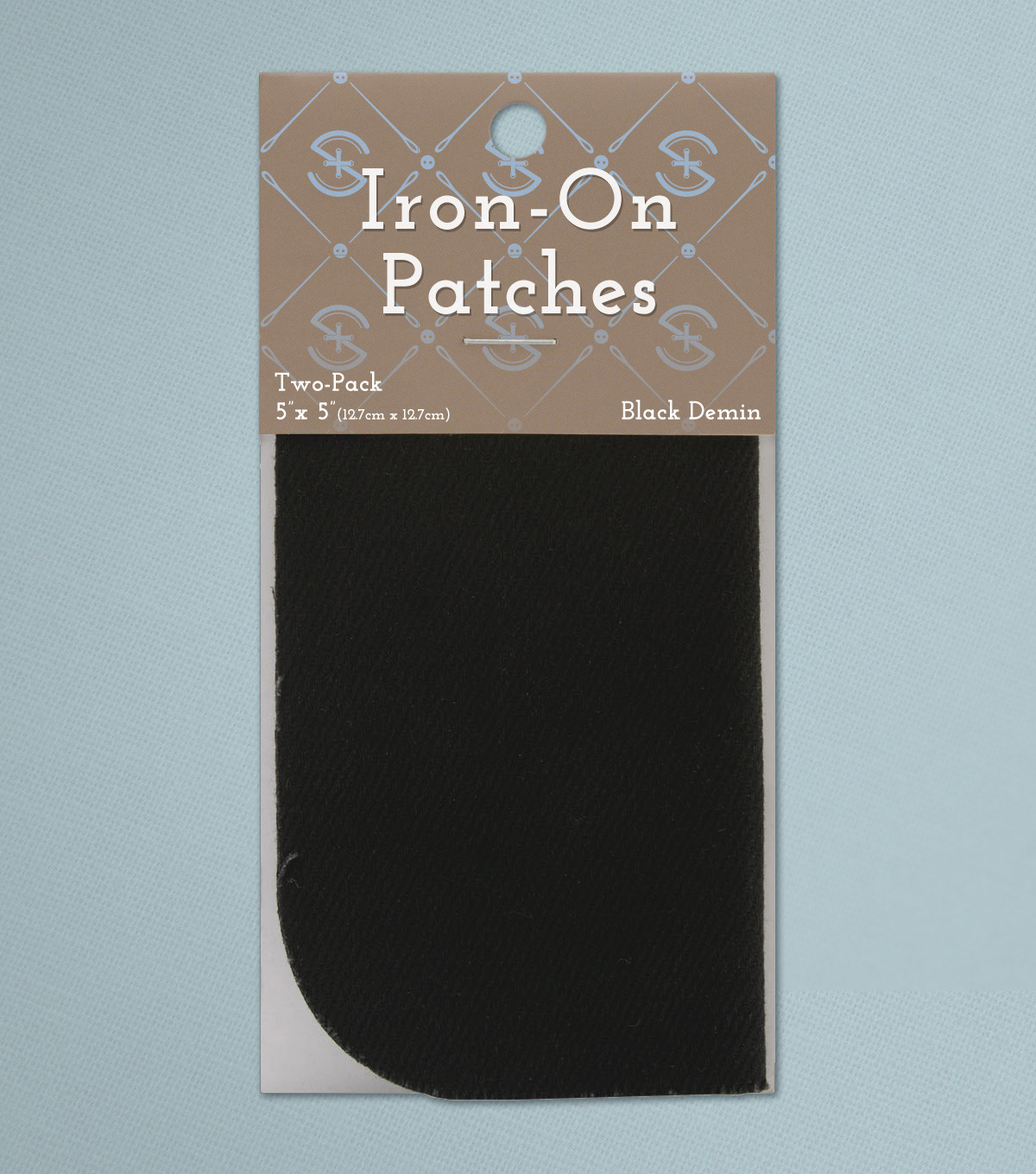
Packaging
Digital Collateral

